Runway Financial
The finance platform you don't hate.
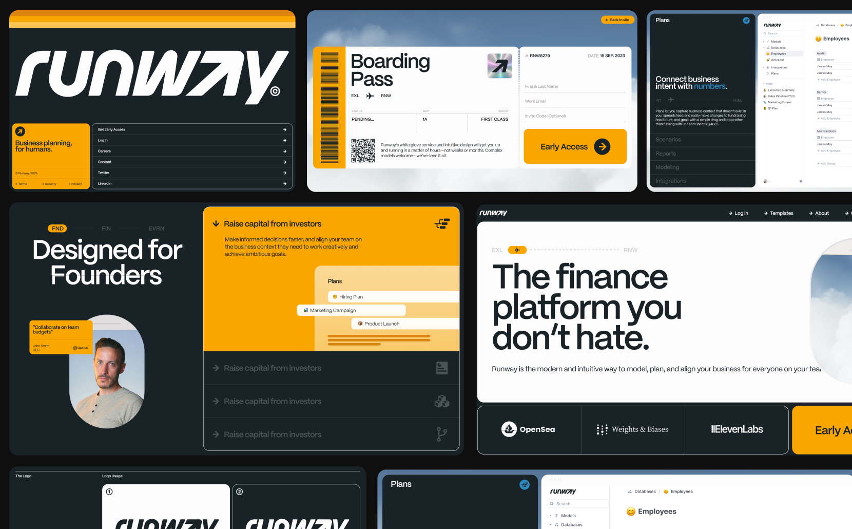
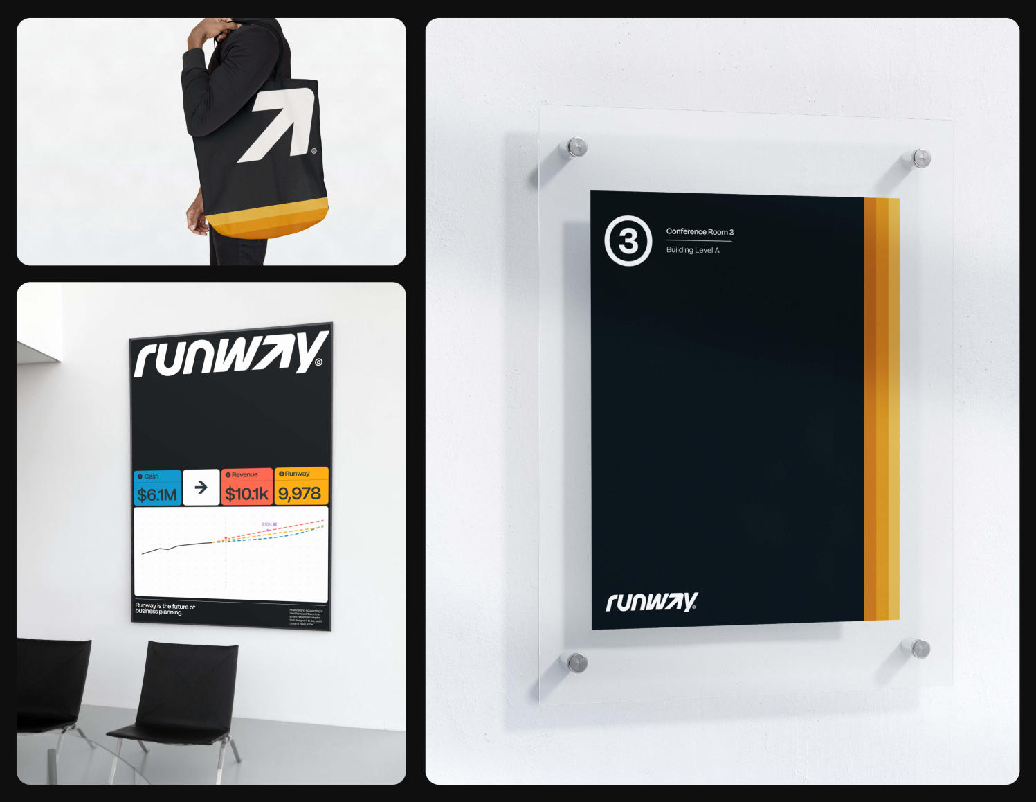
We partnered with Runway Financial to craft a new identity and website that has users running to grab a window seat. Drawing inspiration from airport signage, wayfinding, and the air flight experience, the team created a first-class brand that stands out from the crowd. Let’s show you how we did it.

Initial Flight... Designing the Runway system
Inspired by the world of airport signage, wayfinding, and the air flight experience, we embarked on a series of daring iterations to ensure this brand soared above the competition. Just like a skilled pilot meticulously plans their flight path, our talented team at Reform Collective meticulously charted the course for Runway's logo. We navigated through a storm of ideas, exploring various concepts that would capture the essence of the brand's mission—modeling, planning, and aligning business goals for startups. Like all brand projects, we didn't nail the mark on the first pass. With constructive iterations and feedback with the Runway team, we created a mark that really tells the story of Runway's mission and offering.


Unleashing creative turbulence
As with any creative journey, we encountered moments where the wind didn't quite catch our wings. We soared through sky-high stacks of concepts, only to find that they didn't align with Runway's distinctive essence. Despite our initial enthusiasm, we had to acknowledge that some attempts missed the mark—like a plane veering off-course amidst unpredictable gusts. Undeterred by setbacks, we approached each rejected direction as a stepping stone towards greater clarity. Our team, relentless in our pursuit of excellence, viewed these moments as valuable learning opportunities. We dissected each unsuccessful iteration, extracting insights that guided us closer to the perfect solution.


